


old man yells at cloud dot jpeg —
It’s hard to like most of the new layout—but having a dark mode is nice.
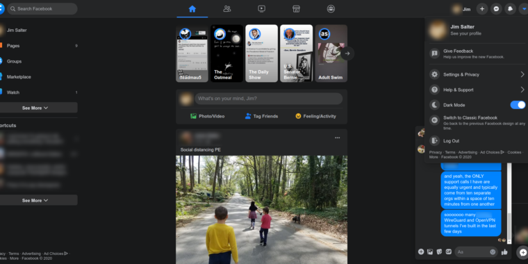
Enlarge / The new design does at least include a dark mode. I generally prefer bright layouts, but if you have a bad habit of Facebooking in bed late at night, this is less likely to prevent sleepiness.
Jim Salter
Sometime last night, Facebook’s new design layout rolled out to my personal account. It assured me that I could switch back if I didn’t like it, so I immediately tried it out. I just as immediately switched it off and never looked back. At least, I never looked back until this afternoon, when the powers that be at Ars said—and I quote—”feel free to hate review it, if you want.”
I am a professional if nothing else, so this is not a hate review. But I must admit it’s a “visceral dislike” review, and perhaps some readers will appreciate—or at least not mind—the things that turn me off so strongly about the new layout.
If you like landscape browsing on a smartphone, you’ll like the new Facebook
-
This is the current “old” Facebook design, which has been in place largely unchanged for a few years now. It’s reasonably information-dense and—apart from the giant Story header—usually fits several posts per page.
Personally identifying information (and the odd profanity) are blurred out.
Jim Salter -
Welcome to the new Facebook layout. On a standard 1080p monitor, it looks like the world’s biggest phone-turned-sideways. Dislike.
Jim Salter
I do the majority of my Facebook browsing on a desktop PC—a serious desktop PC, for serious people, with dual 24″ monitors in 1080P. I strongly dislike layouts that present me with less information and waste a ton of real estate, and Facebook’s new layout does exactly that, in spades.
The old Facebook layout generally fits at least two or three posts per page, at least once you scroll past the giant Stories banner. It also allows you to keep multiple Facebook Messenger chats open, in separate floating divs at the bottom of the screen.
Once you switch to the new Facebook layout, the first, overwhelming impression is one of supreme embiggenment. The text sizes are larger, the elements are more widely spaced, and very little fits on the screen at once.
The Stories banner is, thankfully, less obnoxiously huge than it was on the old layout. That’s a matter of sheer necessity, unfortunately; it has to be smaller in order to fit even half of a post underneath it on the new scale of things. I was unable to find a single pair of posts on my timeline that would fit on one page under the new layout—and at least half of them were at least two pages tall, all by themselves.
The Messenger functionality is also diminished, with only a single chat visible at any one time. If you click another contact or group on your contacts list, your current chat disappears, to be replaced with the new one.
Notifications are less clunky
-
The old design’s notification area just sort of randomly obscures multiple elements. I didn’t realize how obnoxious that was until I saw the new design’s list all the way to the right.
Jim Salter -
Aside from dark mode, the new notification area is nice—it obscures the contact list, instead of just randomly covering the posts in the page itself.
Jim Salter
There isn’t much that I like about the new layout, and there’s quite a bit that I detest. I will say that the new notification list is nice, though. The old notifications list just sort of sprawled over whatever parts of the page it happened to land on, basically making the whole thing useless while notifications are visible. In the new layout, the notification area is pinned all the way to the right, leaving posts uncovered.
In the new design, you can also continue to scroll, browse, and comment on posts in your feed while Notifications are up and pinned to the far right. Messages, unfortunately, are covered—and you only get a single message visible in the new layout, whether the notification list is covering it or not. So you’ll need to close the notifications if you want to chat with your friends—and it’s considerably more difficult to chat with multiple friends simultaneously, since only one message can be visible at a time.
Conclusions
I suspect that this new layout—much like the auto-moderator bug that began pseudo-randomly eating valid news posts this week—is another instance of CEO and founder Mark Zuckerberg’s famous motto, “Move fast and break things.”
The design feels like what happens when you try to unify a layout codebase between phone-based apps and the desktop website but don’t bother with much in the way of validation or solicitation of user feedback. The new design is probably here to stay and will eventually supplant the current version of “classic” entirely—but I really hope it sees some more refinement first. Until then, I’ll be sticking with the old layout.
The Good
- Now with dark mode!
- The notifications list is much better pinned to the far right instead of occupying roughly the third fifth from the left
- Switching to the new layout and back again is instantaneous and easy
- Within the new layout, switching dark mode on and off again is equally quick and easy
The Bad
- Only one post on the screen at a time. Or less—usually, less.
- Only one message on the screen at a time—no matter how high your resolution.
The Ugly
- Huge text is huge
- Wasted space is wasted
- The layout itself, basically


